What's New in Mortly: July 2026

Here's everything we shipped in Mortly this July - no changelog decoder ring required.
June was sharpen-the-blade month. July? July was ship month. There's a whole new way to build comparison tables waiting for you behind a switch, a long-overdue spring cleaning of Settings, and a stack of quality-of-life upgrades everywhere from your fee sheets to your billing page.
Let's get into it.
The New Comparison Builder Is Yours to Try
You've probably built the same comparison table more than once. Same rows, same order, same highlight on the payment line, rebuilt by hand for every borrower. Why? Because until now, the table didn't remember.
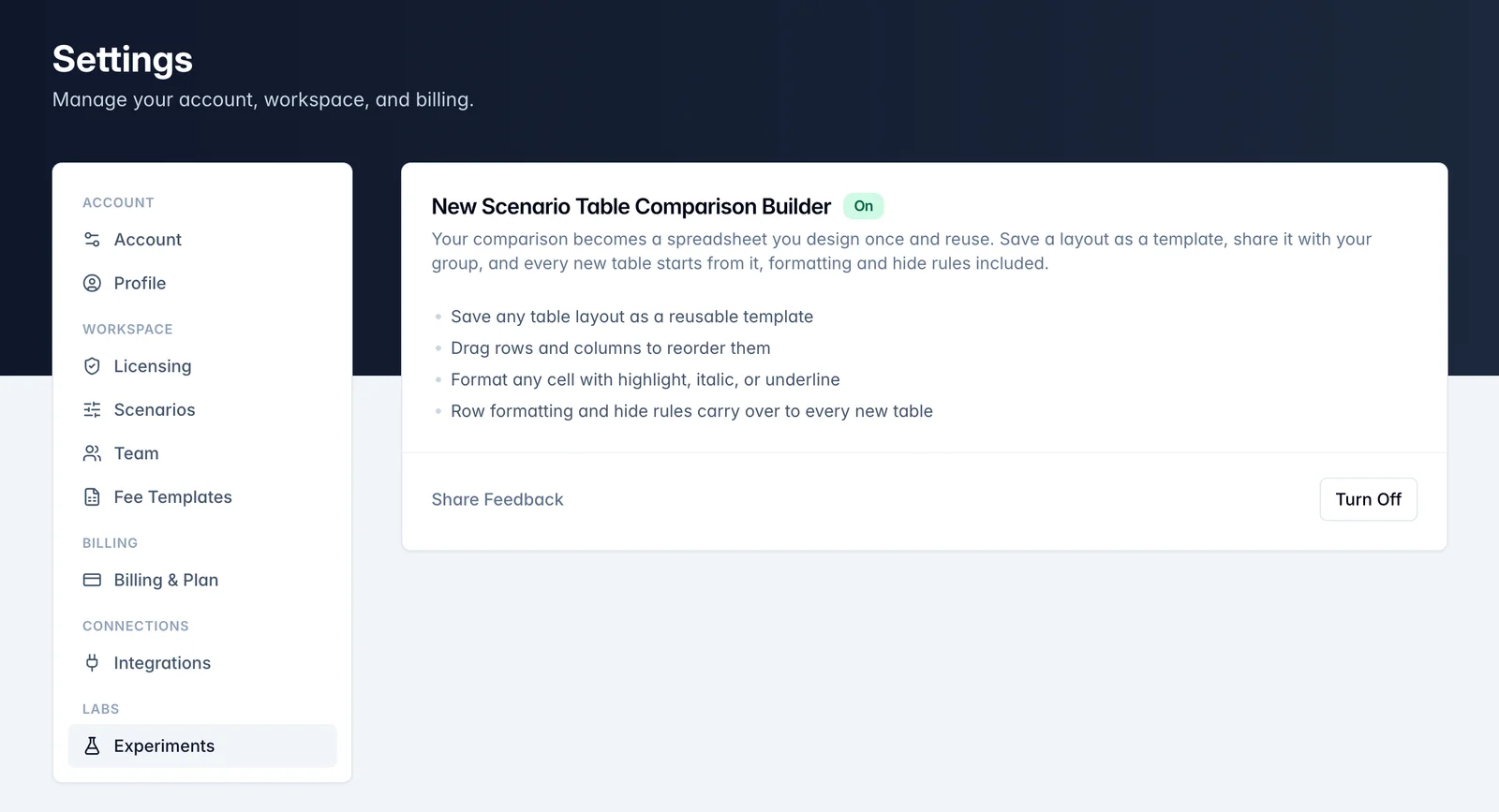
The new comparison builder fixes that, and as of July it's sitting in Mortly waiting for you to flip it on. Head to Settings, open the brand-new Experiments section, and switch it on for yourself. No waiting list, no sales call, just a toggle.
What do you get?
Design a comparison once and save the layout as a reusable template, so your go-to structure is one click away on every deal. Drag rows and columns to reorder them like cards on a desk. Format cells with highlight, italic, or underline so the number you want the borrower's eye to land on is the number their eye lands on.
The whole table starts behaving less like a printout and more like a spreadsheet you actually own.
And if it's not for you yet? Switch back to the classic builder any time. Your tables are untouched either way. That's the entire point of Experiments: you get to try the new stuff early, on your terms, with a feedback link right there so you can tell us what's brilliant and what's baffling.
This is the first feature to live there, and we'll be adding more over time.
Settings Finally Lives in One Place
Quick, where do you change your fee templates? 🤔 It used to be its own page, floating out there next to Billing and Team like three houses on three different streets.
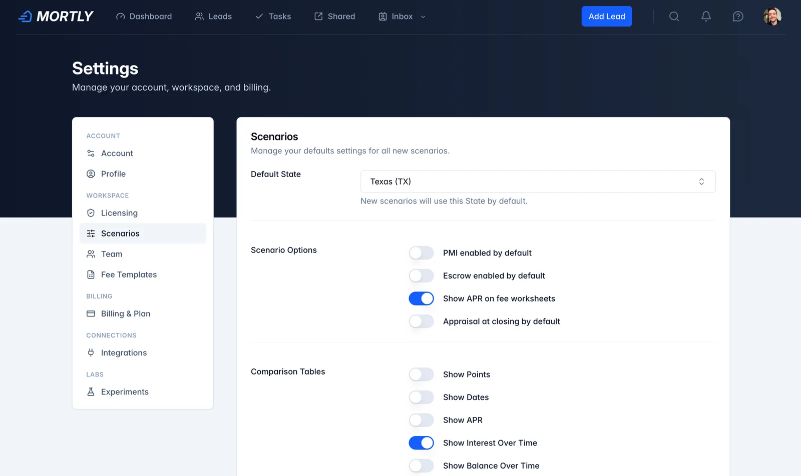
As of July, everything about your account moved under one roof. Settings is now a single place with a sidebar: Billing, Team, Fee Templates, Experiments, all together, one door in. On your phone the sidebar politely becomes a section picker. And since Settings has always lived under your profile menu, the redundant gear icon in the header packed its bags and left. One way in, no wrong doors.
Small change, big exhale. Your account stuff is where your account stuff is.
Per-Diem Interest, Down to the Actual Day
Here's one for everybody who's ever had a fee sheet argue with a lender's closing disclosure over a number of days.
Per-diem interest, in plain English, is the daily interest a borrower prepays at closing to cover the stretch between funding and their first full payment cycle. Mortly has always calculated it for you. The problem: lenders occasionally count those days their own special way, and until now you couldn't overrule the math.
Now you can. The prepaid interest table lets you type the number of days directly, overriding the auto-calculated value when a lender counts it differently. Change the closing date, first payment date, or loan type, and it recomputes fresh.
Refinances got even smarter. Refi per-diem now counts from the actual funding date, which means it accounts for the three-business-day right of rescission, the federally required cooling-off window a borrower gets to change their mind after signing. Weekends and federal holidays are handled, and if funding rolls into the next month, Mortly correctly shows a credit instead of a charge.
Your number and the lender's number should now be the same number, which is a very boring sentence describing a very satisfying outcome.
Audit Every Fee Template at Once
If you run a team, you know the quiet dread: five fee templates, and somewhere in there one origination fee is spelled differently, one is set to the wrong amount, and one is just... missing. Finding out at the closing table is the expensive way.
July's answer: every group now has an Origination Audit link, tucked under Settings > Team.
It opens a matrix showing exactly where origination fees are set, missing, or inconsistent across that group's templates, with actions to add, align, rename, or remove a fee everywhere at once. One screen, whole picture, fix it in one move.
Fair warning: this one takes a little getting used to (a whole group's fees is a lot of data to sift through). If you get stuck, open up a support chat and we'll walk you through it. That's what we're here for.
Billing That Bends Both Ways
A batch of July work went into making your subscription behave like a grown-up:
- Switch directions freely. Monthly-to-annual has been there a while; now annual subscribers can switch to monthly too. And if you've queued a switch for the end of your billing period, the billing card shows exactly when it takes effect, with the option to reverse it before it lands. No mystery, no support ticket.
- Pick your plan from day one. Sign-up links can now carry a plan choice, so if you arrive wanting annual, you start on annual.
- Leaving doesn't lock the filing cabinet. If you cancel, you can still pull up past invoices and receipts from the billing page. Your accountant says thank you.
- Seats you can actually count. Seat usage now shows on the Billing card, the Users list, and the Update Seats dialog, and pending invitations count too, so you can't accidentally shrink your plan below what your team is really using. If you're over your paid seats, all three spots say so in amber and point you at the fix.
✨ The Little Things That Add Up
The monthly grab bag of upgrades you'll feel more than notice:
- Fee sheet themes went team-wide. Anyone on a team can now create and save custom fee sheet color themes, not just the billing owner. You can also export a theme to a file and import it back, so the color scheme you perfected can be handed to a teammate instead of rebuilt from memory. And if you work across multiple groups, your last-used template is remembered per group, so one group's colors stop hijacking another's.
- Emailed comparisons keep every row. Creating a comparison with multiple, mixed scenarios (purchases and refinances) no longer drops the "Funds at Closing" row when copying the table.
- All-cash and zero-rate deals show real numbers. A 100%-down purchase used to leave the APR cell blank, and a 0% FHA or USDA loan blanked the mortgage-insurance row. Both now compute an actual value.
- If your last name is Glowczwski, we're sorry. Our overzealous gibberish detector at sign-up was rejecting real names with long consonant runs. That check is retired for good; a quieter, smarter background check handles the actual spam now. Real humans, whatever your surname, come on in.
See You Next Month
The new Experiments section is live and the comparison builder is in it. Go flip the switch, kick the tires, and use the feedback link liberally. Every item in this post traces back to a loan officer telling us what was slowing them down, and I read every single note.
Talk soon. 👋